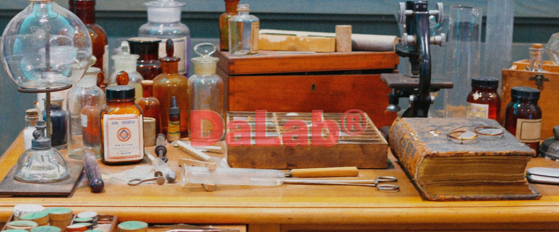
Da Lab® is an online league and esports tournament community that were looking for cohesive branding in order to expand into cryptocurrency and the NFT metaverse.
Branding | Illustration
Parent Logo Process
-
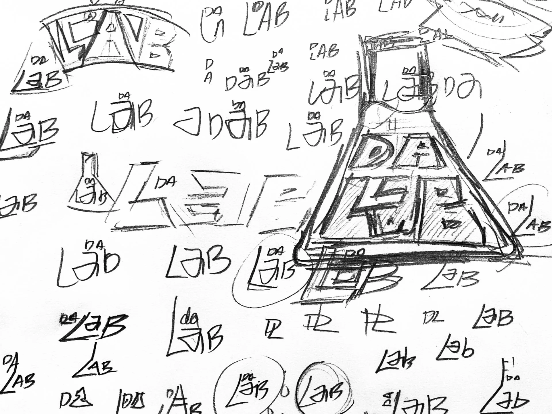
SKETCHES.
The client wanted a very clean wordmark so my process was to create a complimentary icon to be used either on its own or paired. As I began writing “LAB” over an over I found it started to resemble a beaker and decided to go in that direction.
-
Digital Comps
This was a fast moving project so working with the creative director we decided to expand on only two options. The first being the original idea of “DaLab” inside a beaker and the second creating a beaker out of the “A” in “Lab”.

-
Final v2
The client with the first option which I was most happy with. I wanted a juxtaposition of organic handmade mark to pair with the sterile bold word mark for balance. Finally we presented a toxic green as a possible primary color.

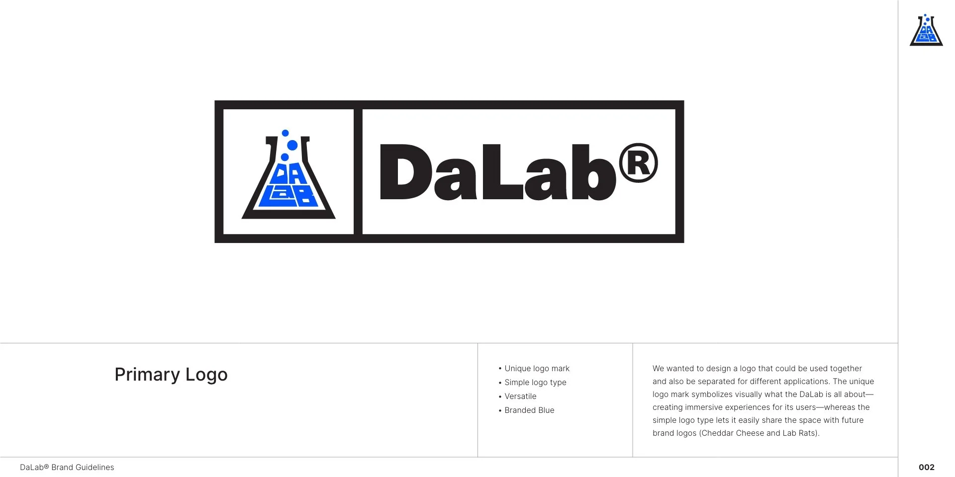
Brand Guidelines
Sub-Brands
-
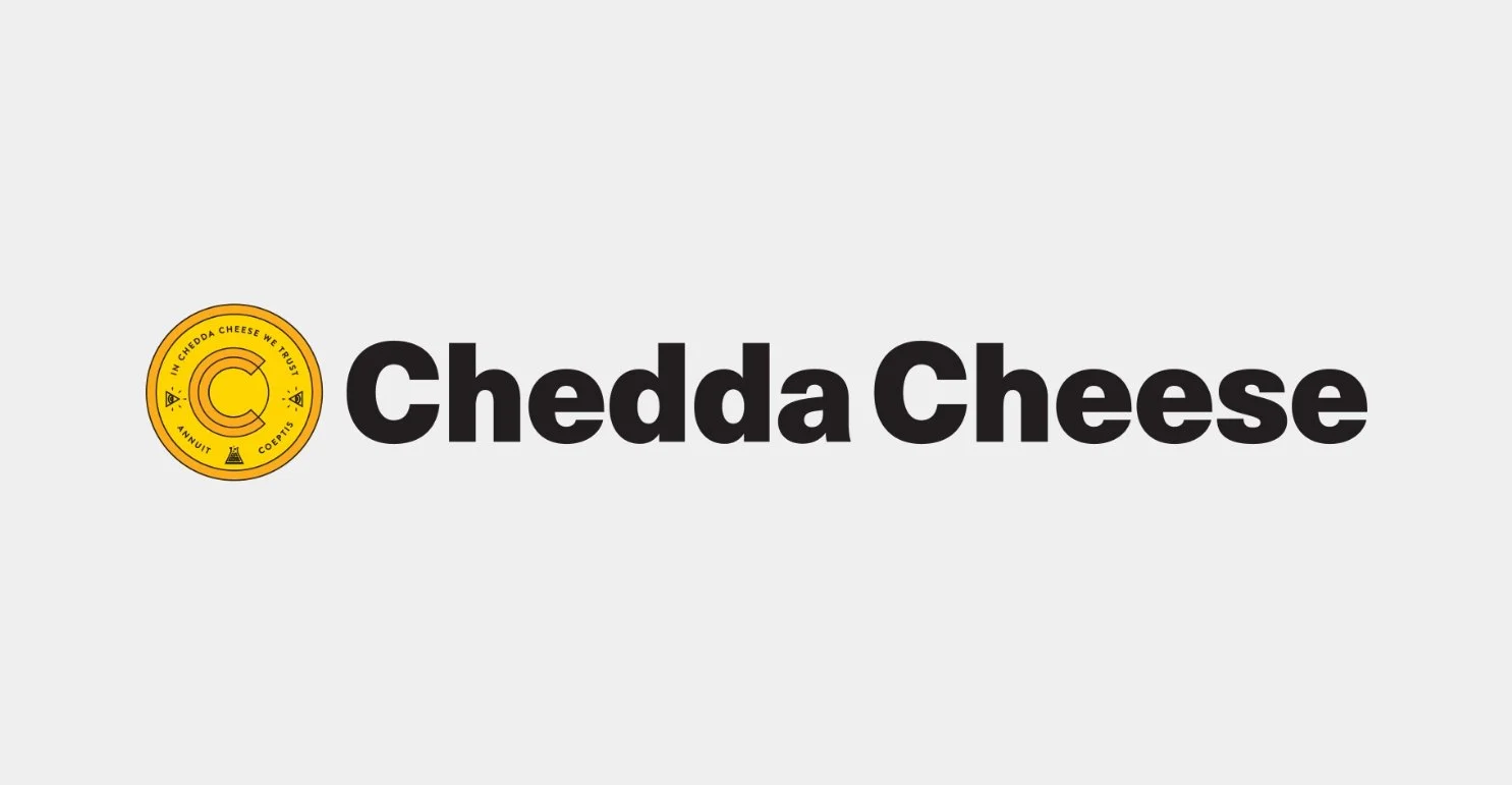
Chedda Cheese
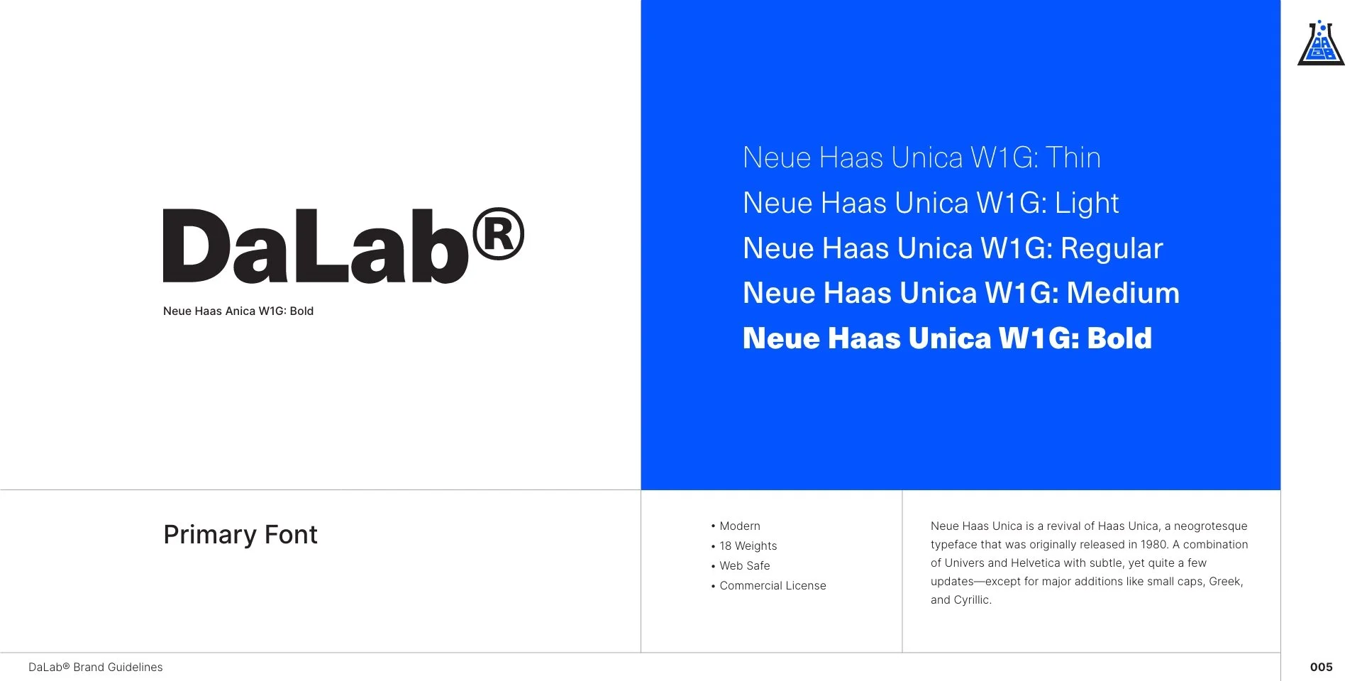
Using the same font (Neue Haas) as the parent word mark I also created the token and wordmark for the future cryptocurrency that will fuel Da Lab.
-
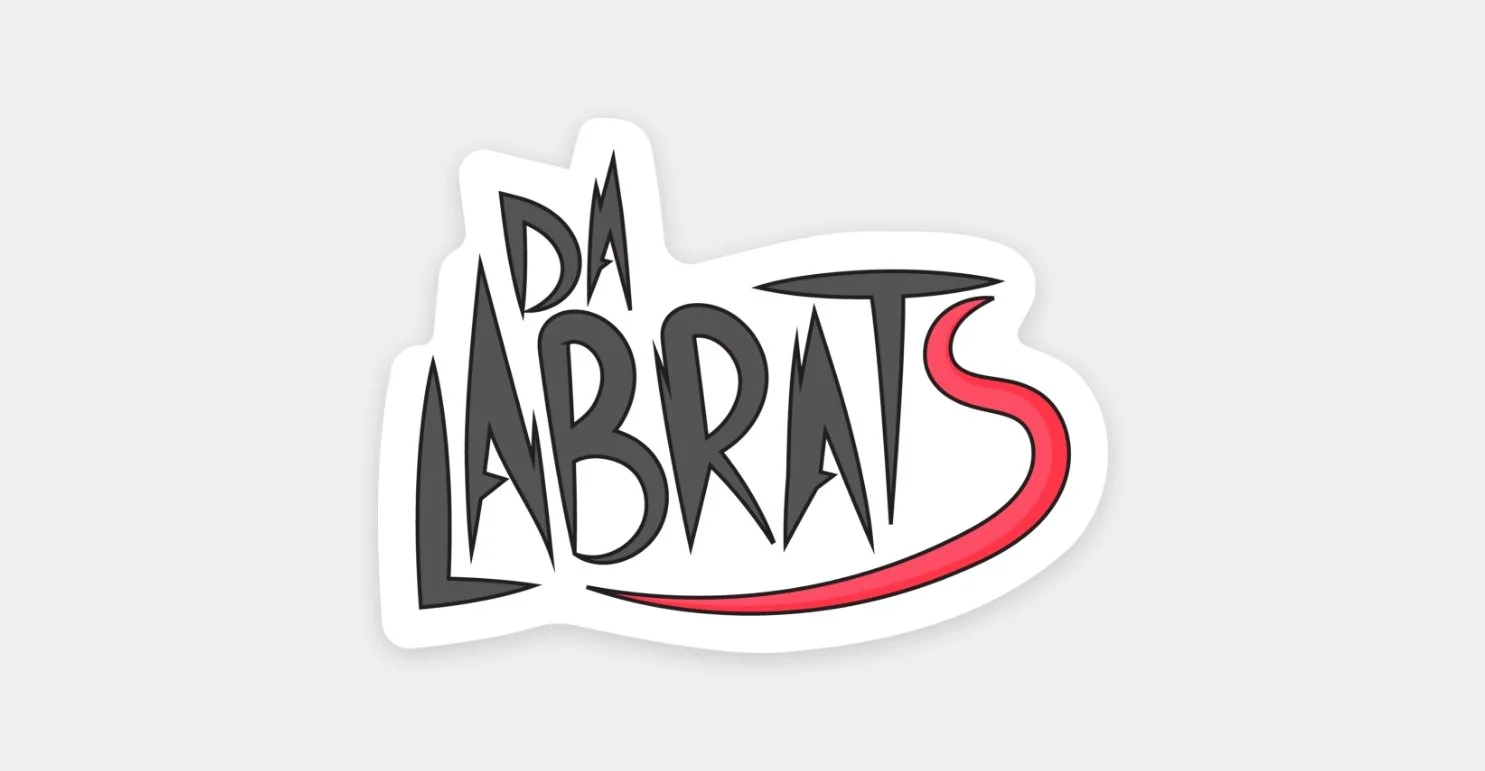
Da Lab Rats
Along with the branding for Da Lab, I also created an NFT series so was also tasked to create a logo that felt familiar to the parent brand but also the hand drawn feel of the new illustrations.
View the Lab Rats NFT Project.

